Puro Taglio
Smart product pairing with seamless filtering
ROLE
UI Designer
EXPERTISE
UX/UI Design
YEAR
2024

Overview
The objective of this project was to design an internal iPad application for a luxury butcher store in Brazil, enabling staff to efficiently browse and manage the selection of wine and meat. The application was developed to streamline internal processes, improve operational efficiency, and enhance the customer experience by providing quick access to pairing suggestions, availability, and event schedules.
Our app helps users to proactively showcase the harmonization between wine and meat, access detailed product information, manage inventory, suggest pairings, check availability, and stay informed about event schedules—all in an intuitive and streamlined experience.

As the UX/UI Designer, I was responsible for refining wireframes, creating high-fidelity prototypes, and ensuring an accessible, elegant interface that aligns with the store’s luxury branding. Collaborating closely with the developer, I focused on delivering a seamless and intuitive experience within a tight timeline. The application’s design prioritizes efficiency, clear navigation, and a sophisticated aesthetic that reflects the high-end nature of the brand.

Wireframe
The initial wireframes were created by the developers, providing a rough structure focused on navigation. However, they lacked clarity in UI components, making it difficult to ensure a smooth and intuitive user experience.
To improve usability and ensure a seamless experience, I enhanced the wireframes by:
Clarifying UI components
Defining essential elements such as buttons, filters, and cards for better interaction.
Enhancing navigation flow
Organizing content to provide quick access to product pairings, availability, and event schedules.
Optimizing user interaction
Structuring layouts for intuitive browsing and efficient in-store use.
I redesigned the wireframes, focusing on key screens such as the home dashboard, product pairings, and product suggestions. These improvements established a structured foundation for the UI, aligning functionality with the store’s operational needs.

Design
With the refined wireframes in place, the next step was to create a visually appealing and functional UI that aligns with the store’s luxury branding while enhancing staff efficiency.
The design focused on:
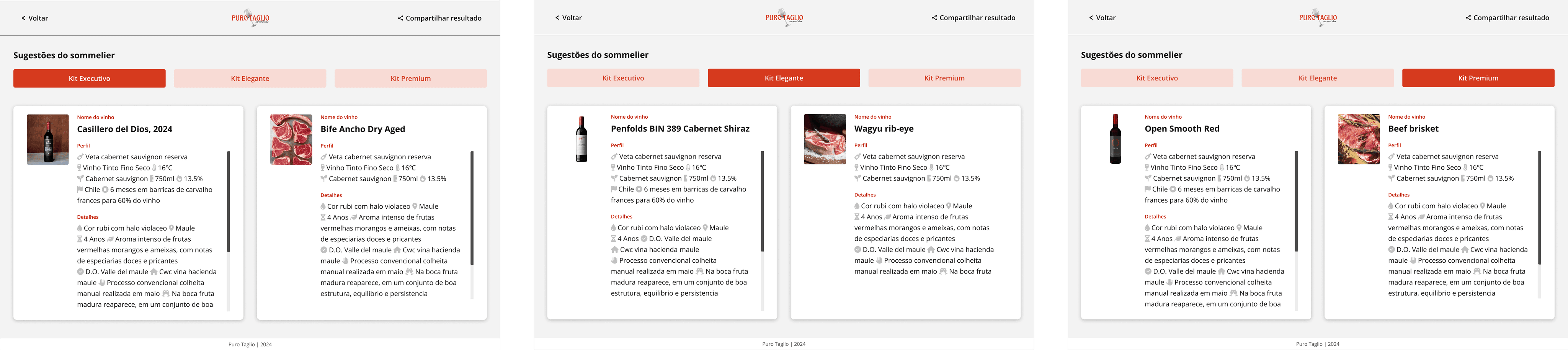
Filterable product suggestions
A streamlined filtering system that allows staff to quickly find wine and meat pairings across three pricing tiers: Executive, Elegante, and Premium.
Card-based layout
Each product is presented in a structured card format, clearly displaying images, descriptions, and pairing recommendations for quick reference.
Elegant & Intuitive UI
A sophisticated color palette and refined typography were chosen to reflect the high-end nature of the store, ensuring an intuitive and aesthetically pleasing interface.
To enhance usability, images were designed to be clickable, opening in a modal for detailed viewing, and a scrollable card system was implemented to keep the interface clean while ensuring all content remained accessible.


Style Guide
The style guide is designed to provide clear and consistent guidelines for future teams, ensuring the application maintains a high standard of usability and accessibility. The guide includes detailed specifications for typography, color schemes, and target sizes, adhering to WCAG 2.2 AA and AAA standards.

Final Design

The application significantly improved the efficiency of the store staff, enabling them to provide better service to customers. The intuitive design and accessible interface allowed staff to quickly find and present product information, enhancing the overall customer experience.